Translate

Showing posts with label layers program. Show all posts

Tuesday, March 25, 2014

A Former Tax Lawyer, Speech Pathologist Finds Fullfilment In Art


This post is about Carla Parris, who won first place in a collage art contest at Fine Art America using a more traditional method of the collage technique.  I am continuing to write about the art of collage, my last post was on a digitally made (usually involving a layers program editor) collage of Sherlock Holmes, his umbrella, violin, violin bow and overcoat, each on a separate layer in an editing program.

Carla has had one busy life with her career as a former Speech Pathologist and Tax Attorney.   Now apparently retired from her previous jobs, has time to create and find fulfillment in her art.


This is the interesting part, her collage 'Ascending Praise' (as seen above) contains old art as well as new.  She explains it this way, "The original piece I never completed and didn't really particularly like in its initial state; it found new life in this collage, and made me glad I heeded an art teacher's advice to hold onto our "dogs," since you never know what you might eventually be able to do with them.  I still have others yet waiting transformation!"  I say it's always nice to have some backup art, I can relate!

She goes on to explain her "...collage incorporates torn pieces of a watercolor painting, snippets of sheet music, gauze, and gold webbing. The words on the music at the bottom say, 'To the God of glory.'  They, along with the composition which seems to have a floating and ascending movement, inspired the title, 'Ascending Praise'."

"It's heavily textured depth comes from its multiple layers incorporating rich water colors of teal, magenta, and gold with white and cream tones.  It reflects Carla's background in conventional scrap booking, working with textures and layers using the same process, only now using torn strips from the old water color painting.  A piece of sheet music added at the bottom was an afterthought which she says completed it and added yet another layer and additional depth."


The message here seems to be don't throw away your art no matter what it looks like!  I know from experience that has been true about my photography, often I can use an out of focus shot, sharpen it and put layers of textures on it, reviving it.   You can sometimes turn that ugly duckling into a swan.  I'm not the kind of artist that is always trying for the perfect shot, there are endless possibilities in the editing program, thank you!

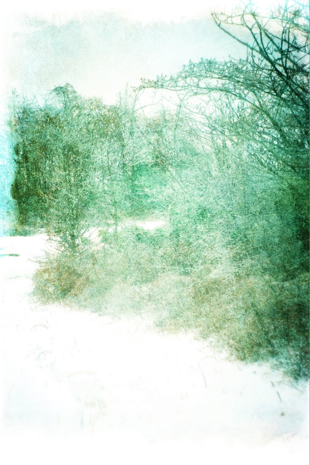
Here are several before and after examples of some of my snow photos that weren't very sharp or not good coloration but look artful when textures are applied.


Now I don't want you to think textures are an automatic fix.  It can take hours to transform or edit photography to get the right look not including the time to capture the shot.  Some photos don't work at all, depending on the light and composition.  Non traditional art methods can take as much time as traditional methods.

Carla Parris gallery website:  http://fineartamerica.com/featured/ascending-praise-carla-parris.html


Sunday, March 23, 2014

Changes To A Sherlock Holmes Design In A Photo Editor Program

I hope you like the BBC television Sherlock Holmes series.  No? Somewhat tepid on the subject?  You may find the editing of a Sherlock Holmes design in a Photoshop layers editor type of program more to your liking.

This is not a "how to" instruction on the layers program, there are lots of step by step instructions on Youtube.com and the internet, it will though give an idea of the flexibility of the layers program should you want to try it and some thoughts on this particular design.

Here is the original design of one of my Sherlock Holmes images:


Technical stuff:

One can choose from different script in the editor program and the lettering type and size can be changed as the overall design develops.  Additional script can be loaded into a Photoshop type of editor.  As long as the layers of the design are saved (it is a separate file like any other image or photo with it's own extension) the design can always be changed using the file.  The Union Jack flag, umbrella, violin, script and textures (the shading and texture) are all separate objects with each on it's own layer.

Design stuff:

I really like the graphic bold lines and color of the British flag.  It is a fairly simple design with no curving lines, the red and white stripes repeating throughout.  I can understand why it is seen everywhere and on everything British or not, it looks good.

My only regret is the British flag should not be on chair seats or used in any way that treats it as a common object.  Most would agree Sherlock Holmes works for the good of British citizens and others, I believe in Sherlock Homes!  This image will most likely hang on a wall or set on a table or desk.

As I finished this design I thought I could add more detail which in this case may make it more interesting especially if it is something of a personal nature.   By adding a violin bow, I thought it wouldn't be overly hard to find an image and execute.  As mentioned in an earlier post I found one and contacted the company for permission to use it since it was not a public domain image.  Here is the image with the added violin bow which is on it's own layer so it can be moved anywhere, angled to any degree, duplicated as many times as desired even a mirror image can be made with all of the aforementioned:


I feel this is a nice image and would like to keep it, then I got another idea and thought it would be nice to have Sherlock's overcoat in the image too.  The idea for the coat was for it to be on a hanger or hung on a wall peg looking as though he had just left the room and would be coming back later.

I have tried to stay away from using any identifying images or drawings of celebrity faces because if used for commercial purposes it is against the law unless there is a signed release, it doesn't matter if you took the picture yourself or someone else did unless it is for editorial use only, it is not lawful.  To avoid this potentially messy problem one has to be creative.  The coat was a little more difficult to find since it couldn't be on a body and not Benedict Cumberbatch's!

I found a coat and here is the image:


What do you think?  I wanted it to look like Sherlock had just whipped into the room, like he does, hot on a case spouting out nonsensical words, seemingly on the surface, but in reality clues to the case!  On closer examination one can tell it is not a wood trench coat and more like a jacket.  It's poetic license, I'll explain that later.  My sister thought the coat looked like a shroud!  In order for it not too look like this is about an undertaker, should I slim it down slightly so there is less black?  I don't want it to be too narrow, lose it's shape and folds so it is hard to tell what it is or be too small and compromise the look of the design.  The rule of thumb is to have varied sizes and mass of objects for interest.

Although he usually doesn't take his violin with him I used poetic license.  This is what I told my sister when I made Cumberbatche's overcoat a dark tweed in one of my images amidst her cries that I couldn't do it since Cumberbatch's coat is a solid dark fabric.  Does Cumberbatch now rule out all other Sherlocks?!! "Pleeeze" I told her, "I need some T E X T U R E!"  It was a compromise.  Earlier movie images show Sherlock in country tweeds. Let's never forget history, that's what makes us who we are today!